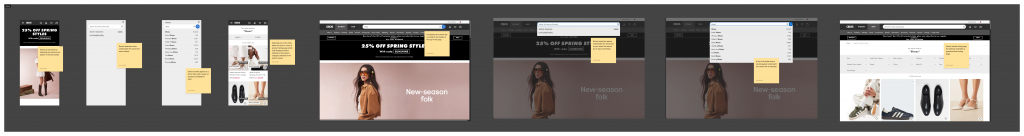
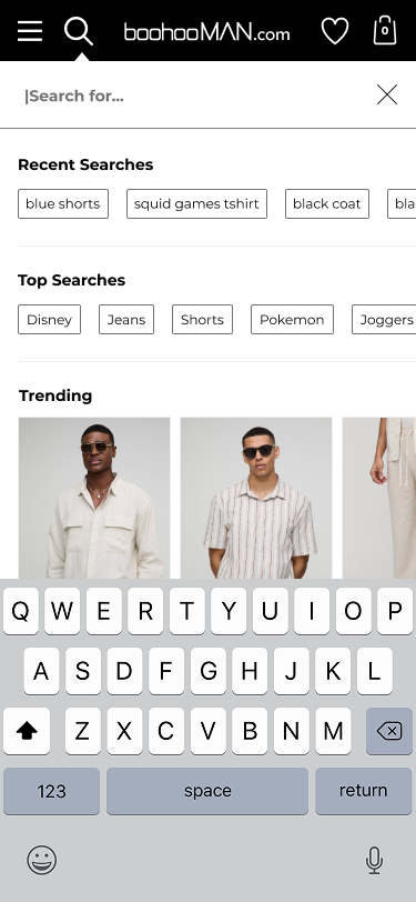
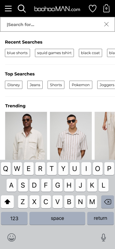
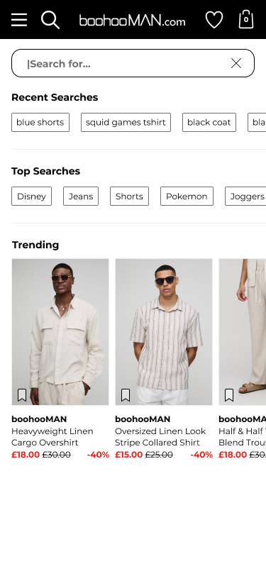
Pre Search
With keyboard
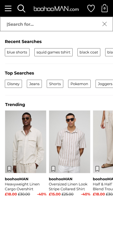
Pre Search
Without keyboard
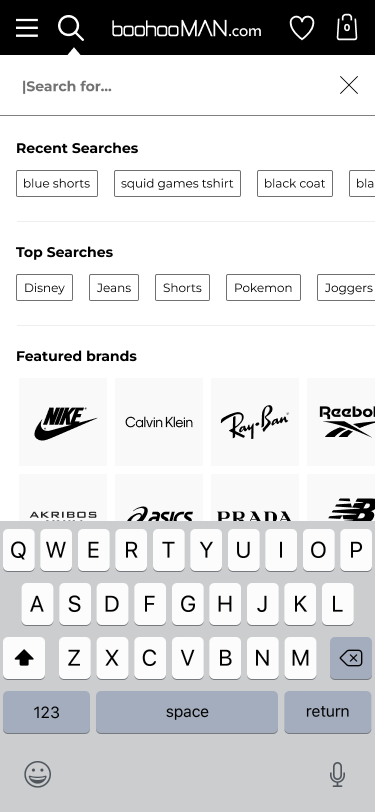
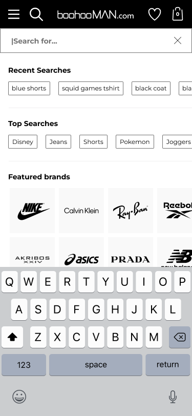
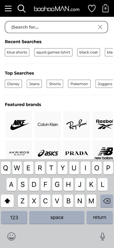
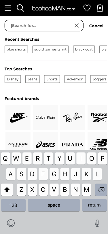
Featured brands
With keyboard
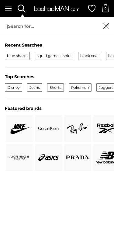
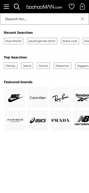
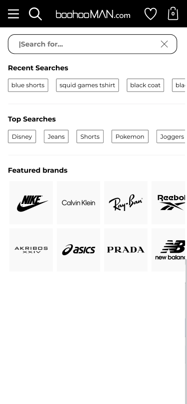
Featured brands
Without keyboard
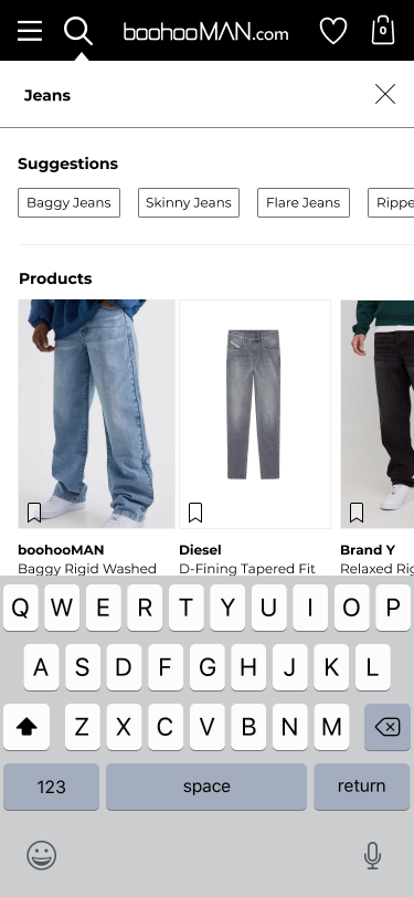
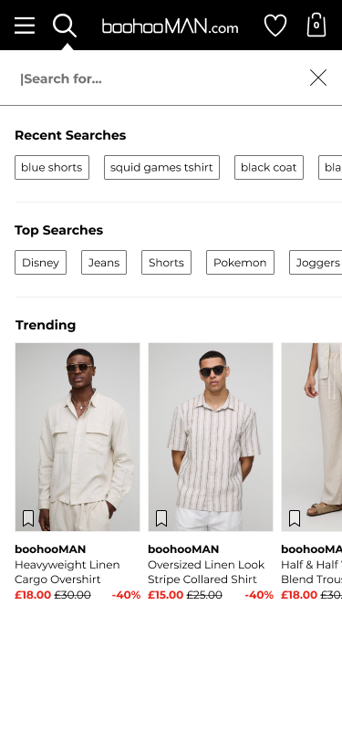
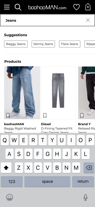
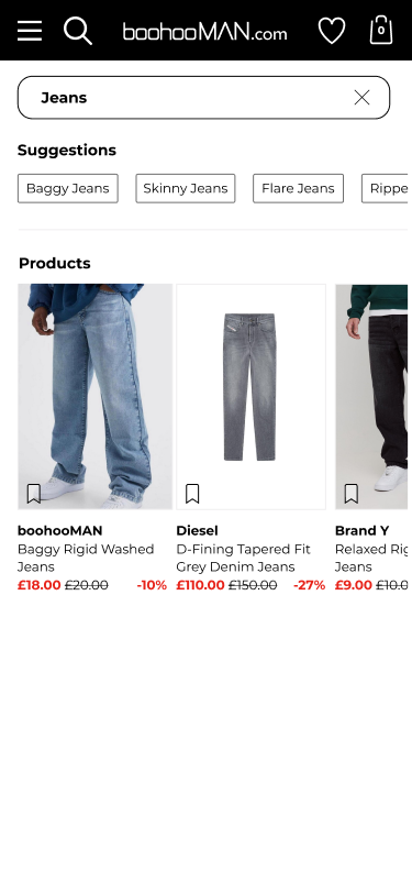
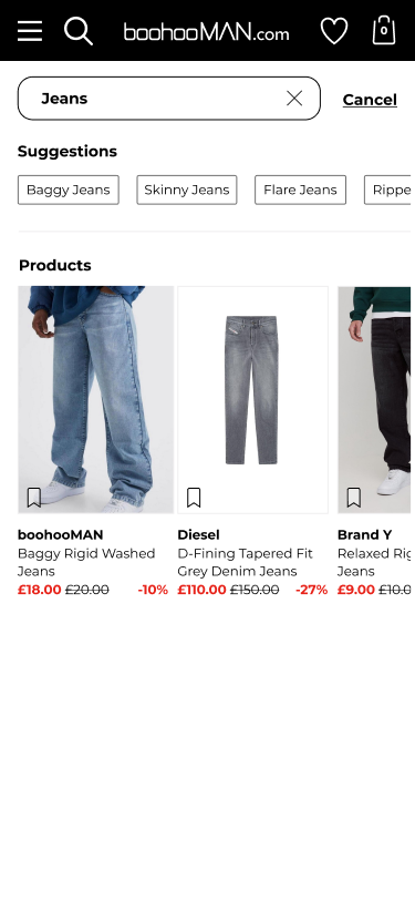
Search results
With keyboard
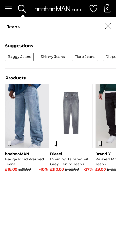
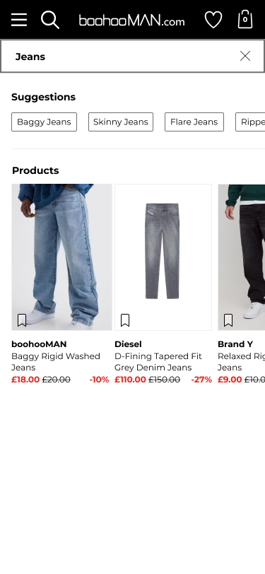
Search results
Without keyboard
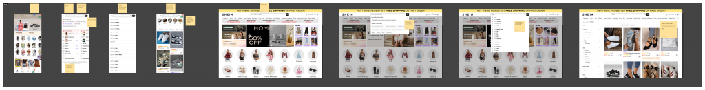
Pre Search
With keyboard
Pre Search
Without keyboard
Featured brands
With keyboard
Featured brands
Without keyboard
Search results
With keyboard
Search results
Without keyboard

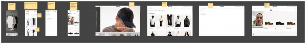
Pre Search
With keyboard
Pre Search
Without keyboard
Featured brands
With keyboard
Featured brands
Without keyboard

Search results
With keyboard
Search results
Without keyboard

Pre Search
With keyboard

Pre Search
Without keyboard
Featured brands
With keyboard

Featured brands
Without keyboard

Search results
With keyboard
Search results
Without keyboard

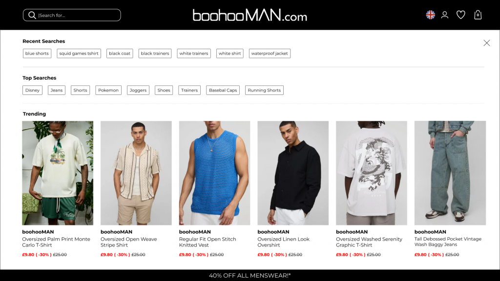
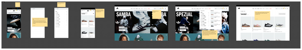
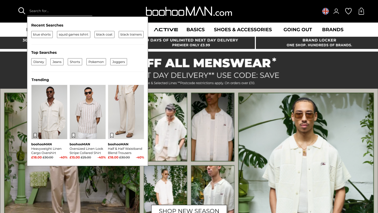
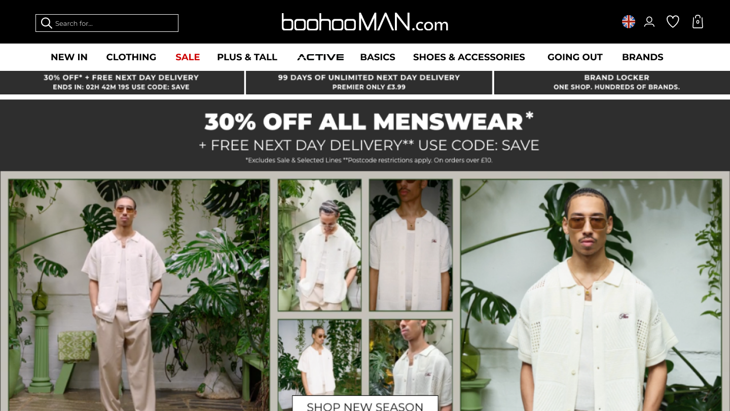
Pre Search
Default before search is active
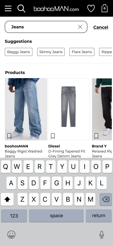
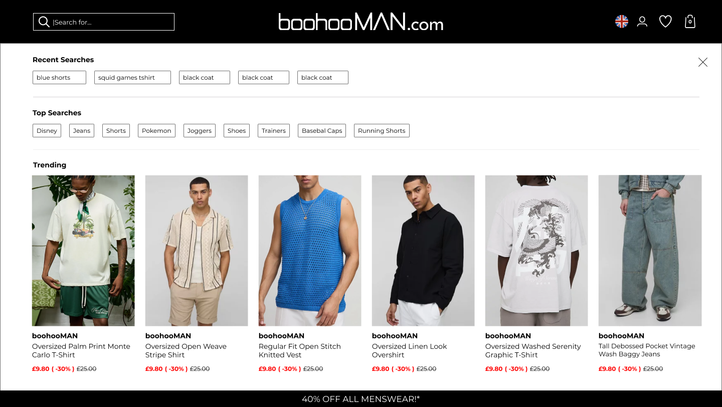
Pre Search
With the search field active
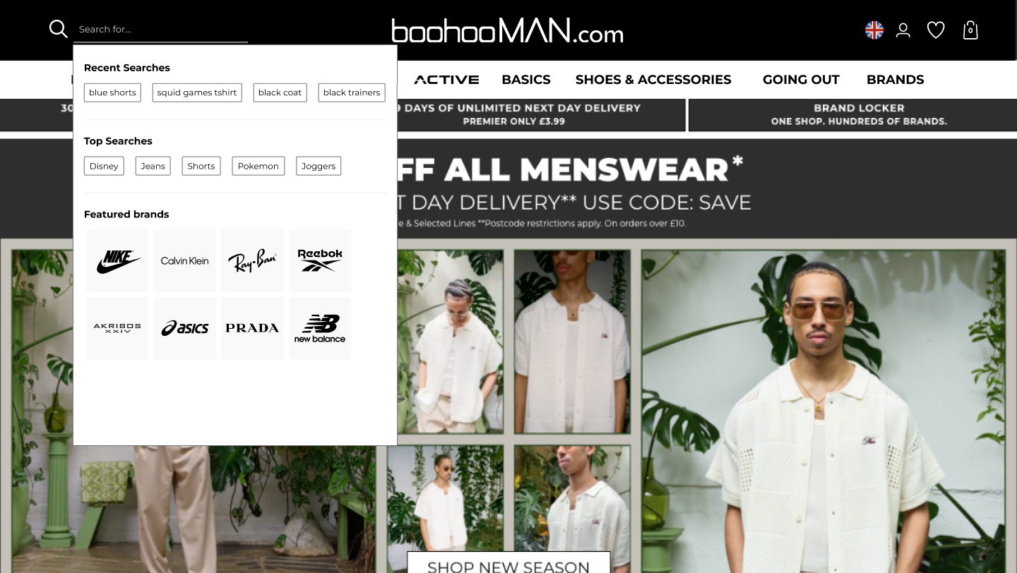
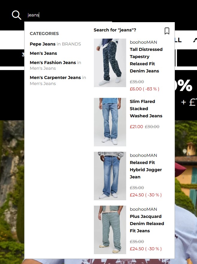
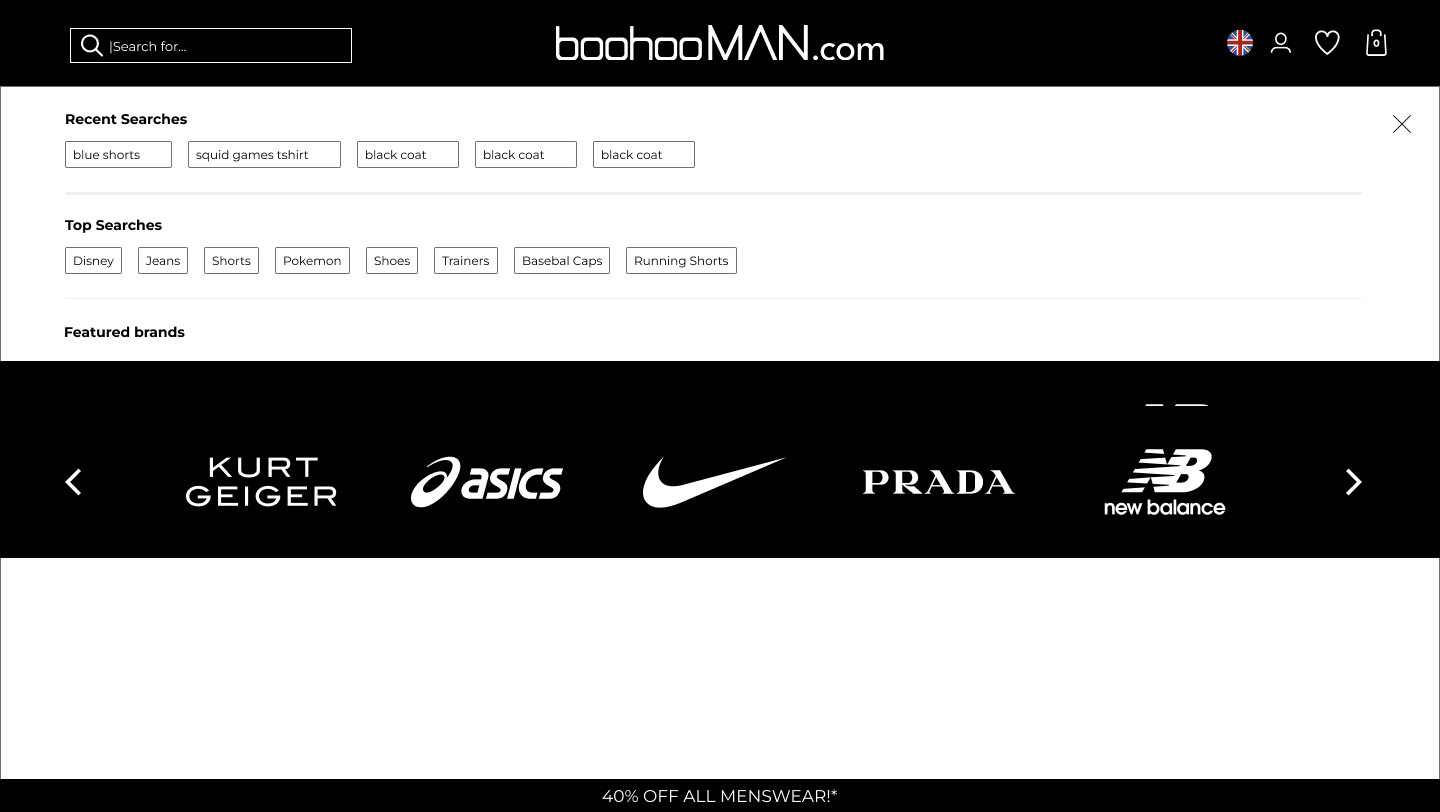
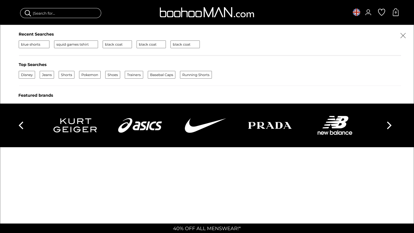
Pre Search
Search field active showing brands
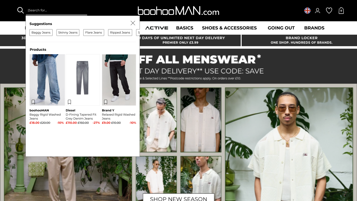
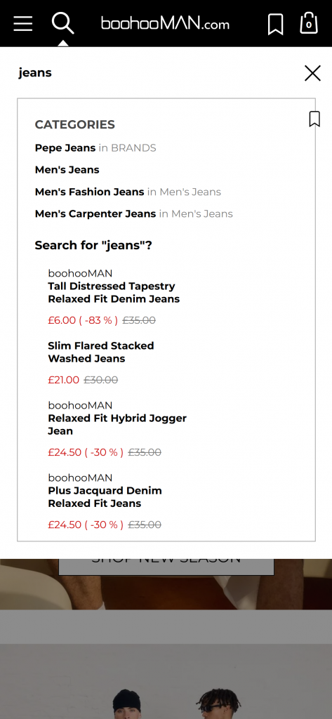
Search results
Desktop version with search results
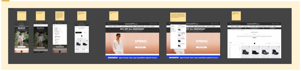
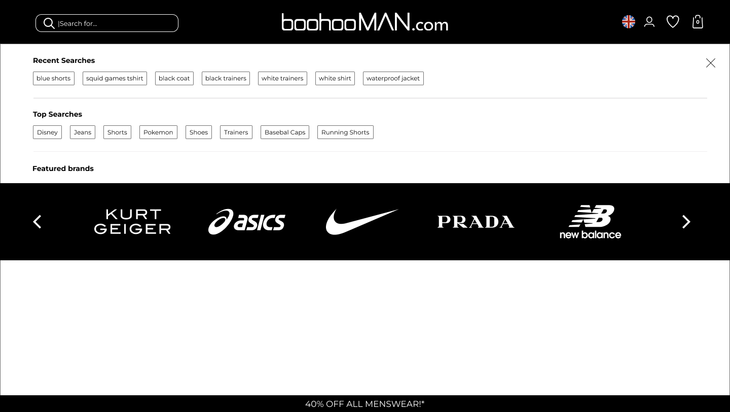
Pre Search
Default before search is active
Pre Search
With the search field active
Pre Search
Search field active showing brands

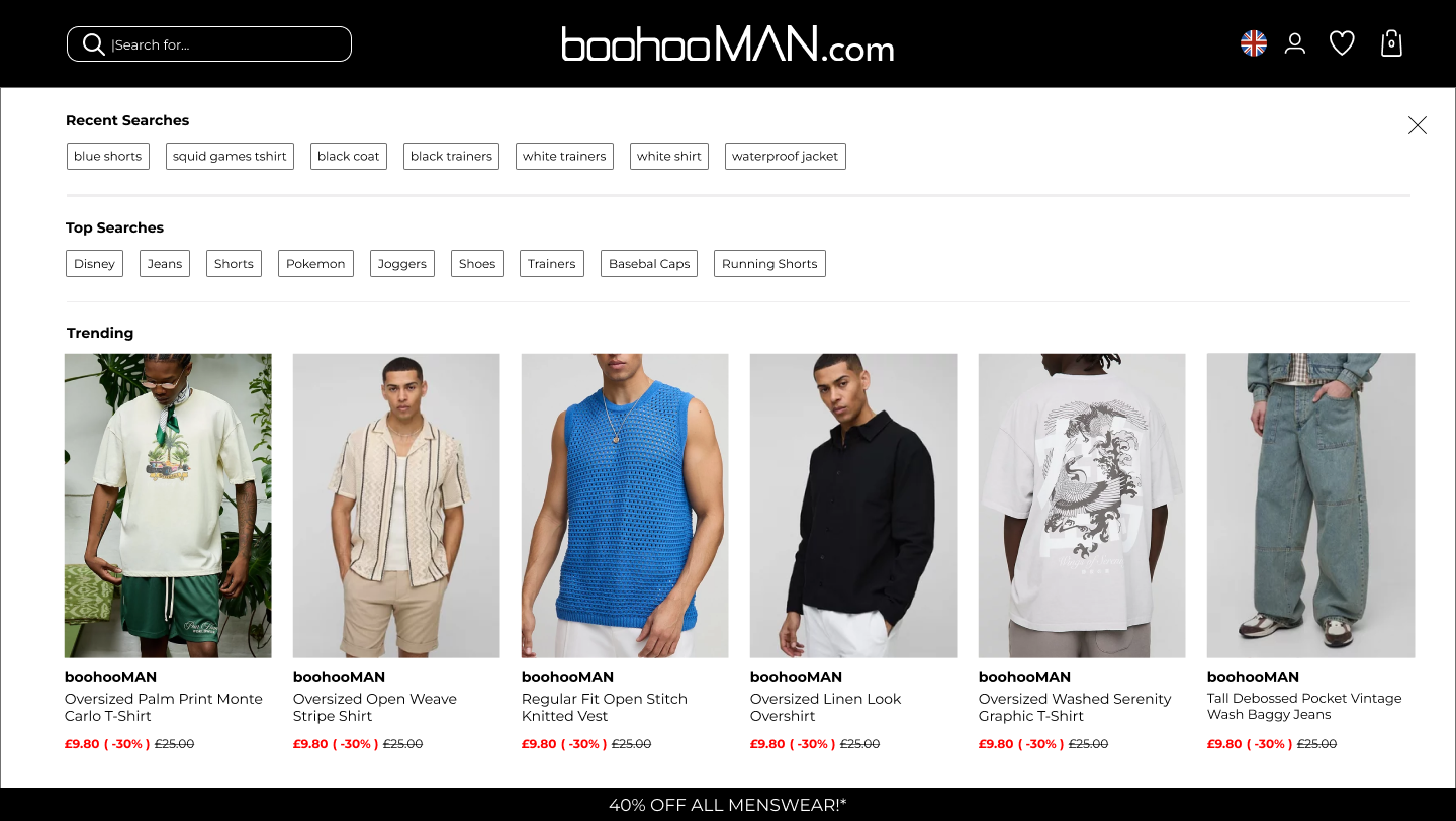
Search results
Desktop version with search results

Pre Search
Default before search is active

Pre Search
With the search field active
Pre Search
Search field active showing brands

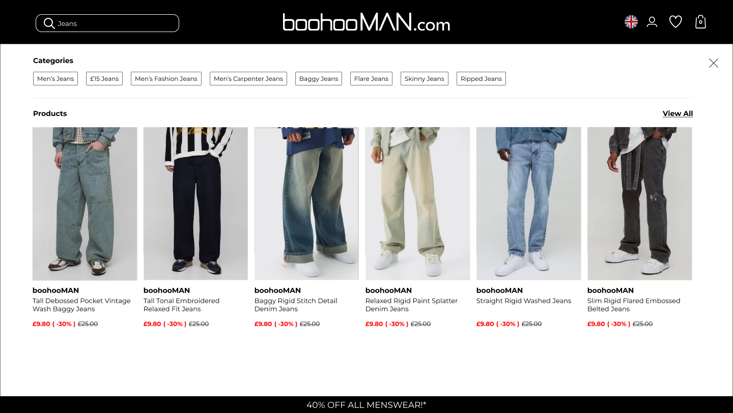
Search results
Desktop version with search results

Pre Search
Default before search is active
Pre Search
With the search field active
Pre Search
Search field active showing brands
Search results
Desktop version with search results