Creating a new design system that improves on the old one
Background
Pretty Little Thing already had a design system but it was unwieldy due to the size and structure of it as it contained elements for both web and the mobile app. With a rebrand project underway it seemed like a good idea to replace it with one that was more manageable.
Brief
The new design system would need to clearly define what is for web and what is for the mobile app and should be structured in such a way so that each component is clearly labelled and identifiable. Each of the elements should adhere to the same rules around their anatomy such as spacing, margin, corner radius and so on.
Approach
The design system was to be split into two main files. One for the website and the other for the mobile app. This would allow for more control and clear definitions around device specifics, in particular for the differences in IOS and Android.
The layout and structure should follow the Atomic Design Methodology with each of the components labeled to reflect that. Colours were added to the Figma file as variables to make them easily accessible within designs and so were the typography elements with each font being selectable and clearly labelled.
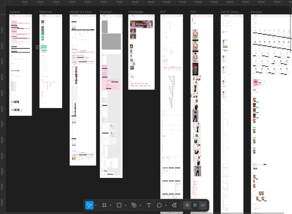
To allow for ease of use the components were seperated out into their own page within the DS so that it related to what page they are used on in the website and app.
The old design system had become cluttered and difficult to search through.
The new design system is structured in such a way to make it easier to navigate.
Structure, layout and components
Instead of having the DS laid out so that all of the components are located on one page. It made better sense to sperate the components out into individual pages so that there is a page in the DS for every major page or area on the live website. For example, All of the components and elements that would normally reside on the product page will have a page in the DS labelled ‘Product Page’
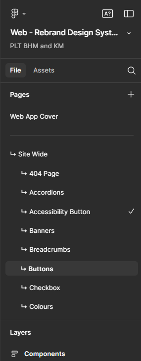
For components that can be found on all pages across the site such as buttons, there is a buttons page but it is in the Globals or Site Wide section within the page navigation in the DS.
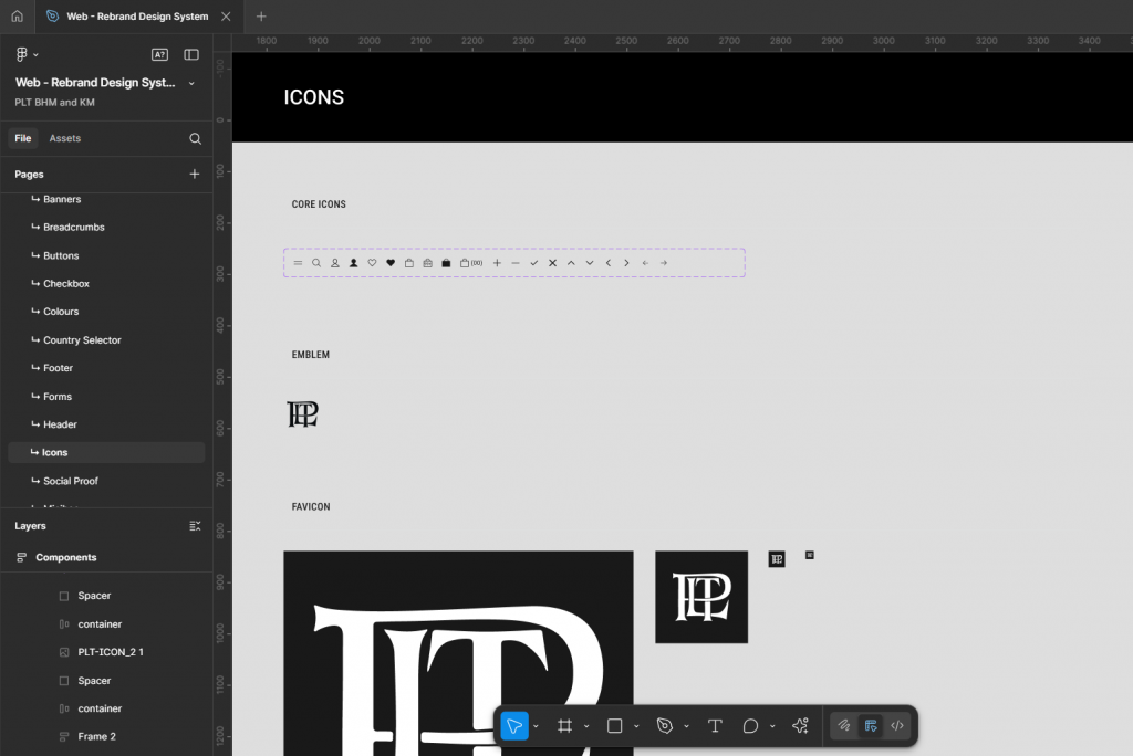
Icons page showing a reduced number of custom icons
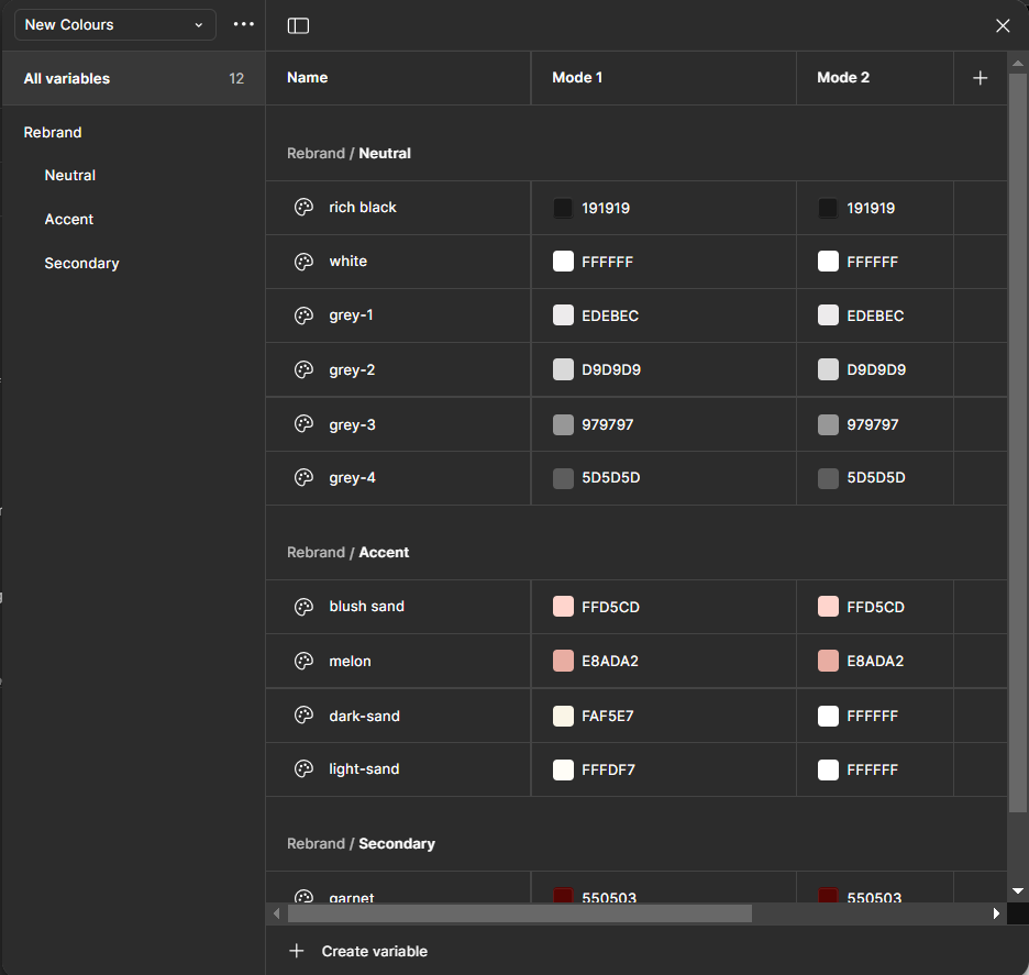
Variables created for each of the brand colours
The new brand colours were to be added to the file as variables so that they can be easily organised and selected during the design process.
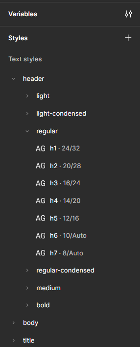
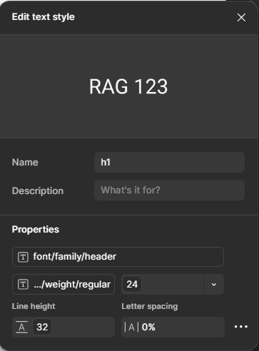
Text styles added with strict rules
Adding a set of text styles to the new design system ensured that only the correct font type and correct font pairings would be used in any new designs going forward.
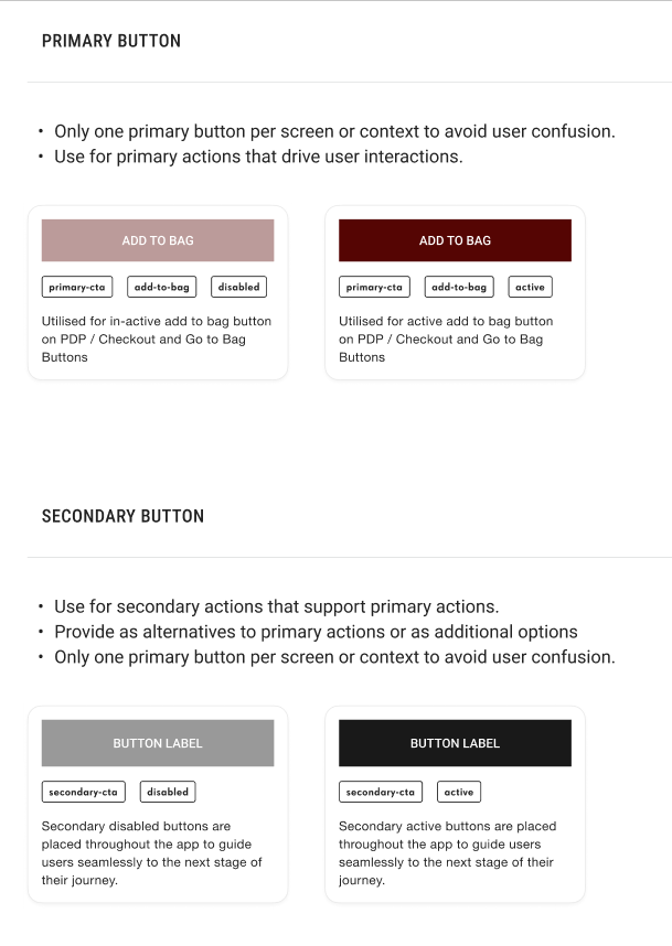
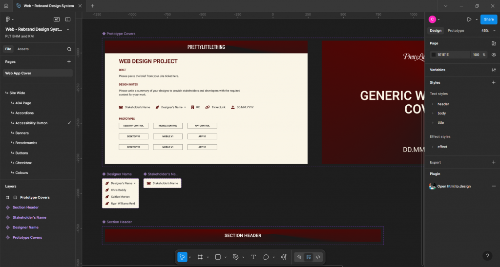
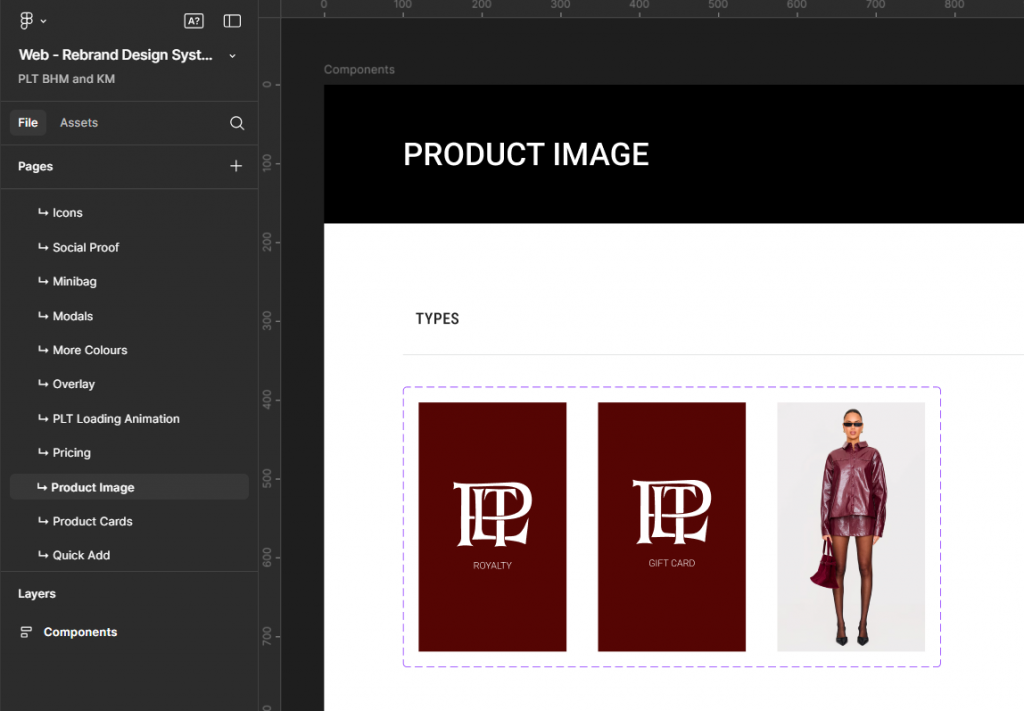
Component page example
The components on each page witin the new design system are laid out in such a way so that anyone who uses it understands what each component is for, what options are available and where the element should be used on the website.
The website design system figma file
I have included a copy of the website design system here so that you can take a look around it for yourself.
Please note that you will need a Figma account and be signed in to be able to view it.